Looks great HappyDay. Very real, very stylish, very well-crafted. Only thing worth consideration is the style of writings - looks like from MS paint - Very simple and cheesy. They contrast with perfectly designed interiors
Some design work in Gimp maybe?
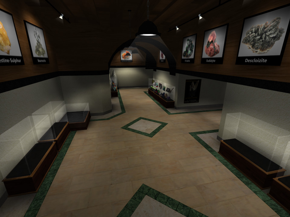
Rooms looks to damn good to contain simple font + outline 5px writings. Specially here:
http://www.mhermann....hibition054.jpg
Only Comics Sans font is missing
Advertisement
ut4_exhibition [Alpha 24]
A small map for TS
#14
Posted 09 February 2012 - 11:30 PM
The wooden (mahogany?) textures really fit the room's look.Very nice models as well
I do agree with maj about the text though,it's perfect as it is,but it could easily be much better if you wanted
Here's a sample done in gimp with the default logos and textures;
http://img35.imagesh...5/8805/txt1.png
http://img715.images.../1020/txt2b.png
I do agree with maj about the text though,it's perfect as it is,but it could easily be much better if you wanted
Here's a sample done in gimp with the default logos and textures;
http://img35.imagesh...5/8805/txt1.png
http://img715.images.../1020/txt2b.png
Advertisement
#16
Posted 10 February 2012 - 05:47 AM
Hahah,thanks Maj,now the question is if Happyday thinks so too
#18
Posted 27 February 2013 - 04:23 PM
It's been one whole year now since the last update. I just want to say that I'm still working on the map more or less active (currently alpha 38). It will take approximately a few more months before I release a public beta. Here are a few screenshots of the latest version which is far more pleasing to the eye than the released a24. Stay tuned.
Have a happy day! :)
1 User(s) are reading this topic
0 members, 1 guests, 0 anonymous users
Advertisement